 Components
Reusable 
Isolated 
Composable 
Native API
document.createElement(tagName[, options])

// example
const Button = (props) => {
  const btn = document.createElement('button');
  btn.textContent = props.value;
  btn.addEventListener('click', props.onClick);
  return btn;
}
Meet React.js
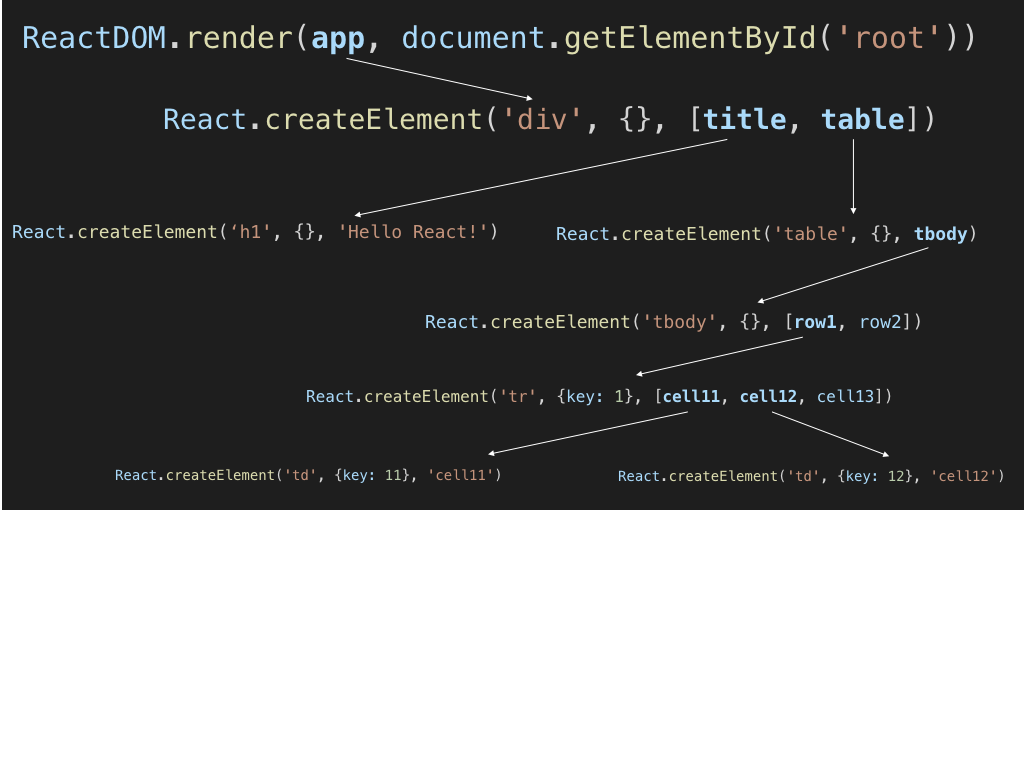
Creating React component
React.createElement(
  type,
  [props],
  [...children]
)

// example
React.createElement('h1', {}, 'Hello React!');
Render using ReactDOM
ReactDOM.render(element, container[, callback])

// example
const Title = React.createElement('h1', {}, 'Hello React!');
ReactDOM.render(Title, document.getElementById('root'));
Composing Components

Composing Components
JSX - The declarative way
// JSX syntax
<type [...props]>[...children]</type>

// Transpiled JS using React.createElement:
React.createElement(
  type,
  [props],
  [...children]
)
// example

const Title = () => (<h1>Hello React!</h1>);

// Transpiles to:
const Title = () => React.createElement('h1', {}, 'Hello React!');
Components tree

// example
const Title = () => (<h1>Hello React!</h1>);
const Container = () => (<div>
                            Parent
                            <Title />
                         </div>);

// Result:
<div>
  Parent
  <h1>Hello React!</h1>
</div>

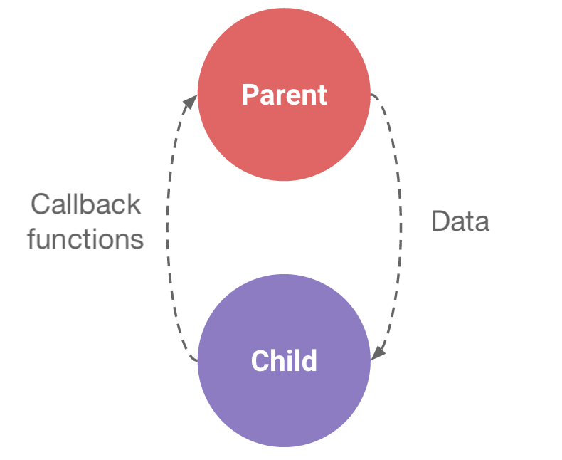
Communicate Between Components
Parent > Child
const Header = (props) => (<h1>{props.title}</h1>);

// Usage:
<Header title="Hello React!" />
// or
<Header title={'Hello React!'} />

// Result:
<h1>Hello React!</h1>
props are read-only!!!
Parent > Child
const Header = ({title}) => (<h1>{title}</h1>);

// Usage:
<Header title="Hello React!" />
// or
<Header title={'Hello React!'} />

// Result:
<h1>Hello React!</h1>
props are read-only!!!
Parent < Child
const Header = ({title, onPress}) =>
                    (<h1 onClick={onPress}>{title}</h1>);

// Usage:
<Header onPress={() => alert('clicked!')} title="Press here" />
props are read-only!!!
Components composition
const Container = ({children}) => (<p>Content is: {children}</p>);
const Title = ({value}) => (<h1>{value}</h1>);

// Usage:
<Container>
  <Title value="Hello React!" />
</Container>

// Result:
<p>
    Content is: <h1>Hello React!</h1>
</p>

Meet React.ts
Function component
import * as React from 'react';

interface HeaderProps {
  title: string;
  onClick: () => void;
}

const Header: React.SFC<HeaderProps> = ({title, onClick}) =>
                          (<h1 onClick={onClick}>{title}</h1>);
Class component
import * as React from 'react';

interface HeaderProps {
  title: string;
  onClick: () => void;
}

class Header extends React.Component<HeaderProps>{
  render() {
      return
      (<h1 onClick={this.props.onClick}>{this.props.title}</h1>);
  }
}
Rendering lists in jsx
const items = [{id: 32, name: 'First'},{id: 43, name: 'Second'}]; const List: React.SFC = () => (<ul> {items.map(item => (<li key={item.id}>{item.name}</li>)) } </ul>);// Result <ul> <li>First</li> <li>Second</li> </ul>
🛠 Try it
git checkout chapter-2- create app components
- use mock cards and display the game board